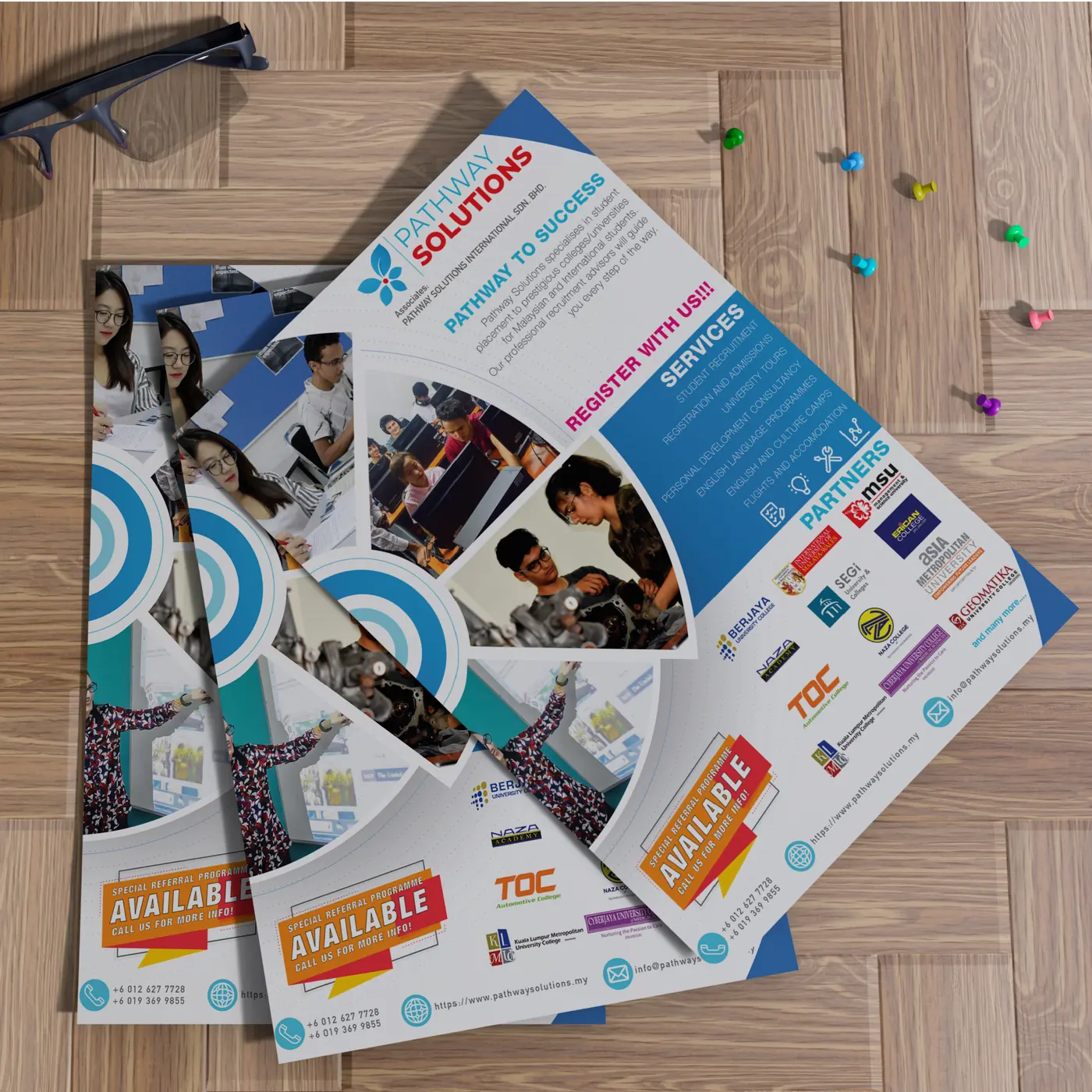
A visual pathway to recognition.
An education consultancy identity organised around one idea: progression.
02
Context
Pathway Solutions is a Petaling Jaya consultancy working in student enrolment, internship programmes and personal development.
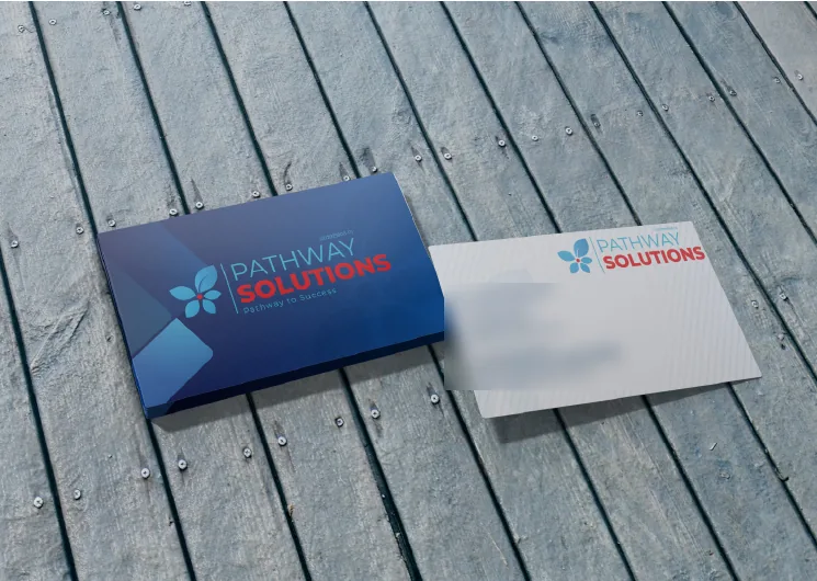
The work covered the logo, website, digital flyers and business cards, with one objective: to build recognition in the education sector and support students’ progression into higher education.
03
Design intent
The identity is designed to feel clear, accessible and trustworthy to two audiences at once: students making a significant decision, and the institutions Pathway works with.
04
The idea
The name already carries the idea, so the identity lets it lead.
- Symbol
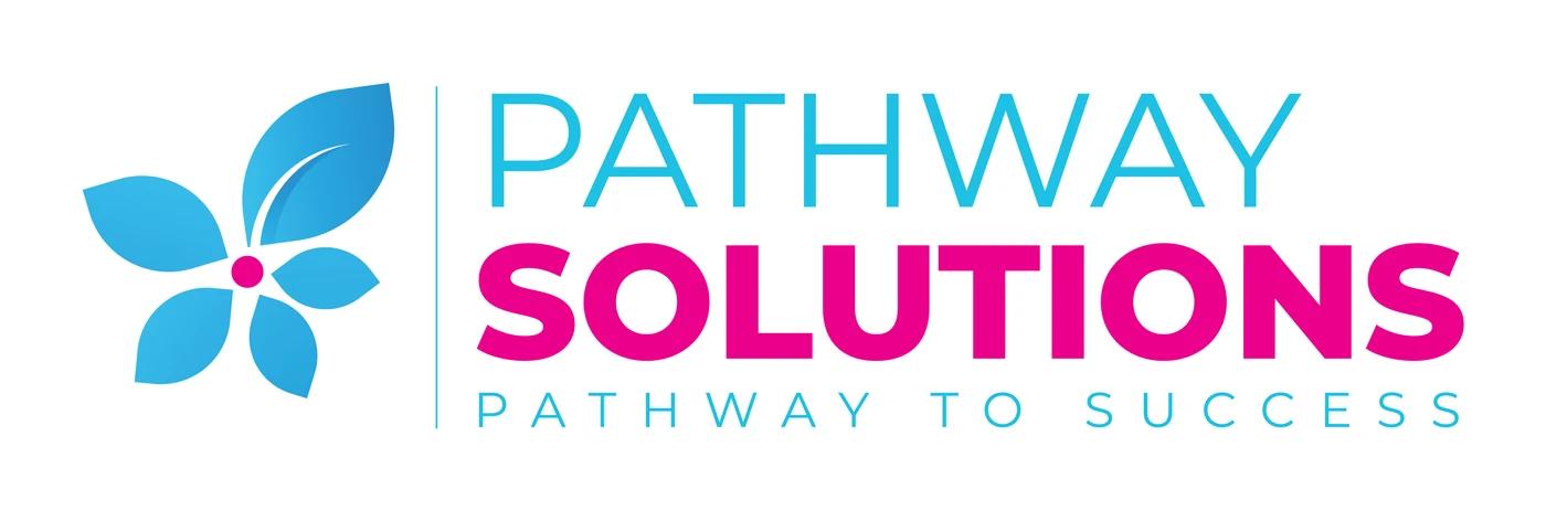
- A small botanical mark of leaves and petals — an image of growth rather than a literal path or arrow.
- Typography
- PATHWAY in a light weight, SOLUTIONS in bold. The step from one weight to the next suggests movement from possibility to result.
- Composition
- A vertical rule separates symbol and name, with ‘Pathway to success’ spaced out beneath as a quiet signature.
- Colour
- In colour, the symbol is set in a cyan-to-blue gradient with a magenta centre, and ‘Solutions’ in magenta.
05
Visual system

06
Application
07
Outcome
The same identity runs from business card to printed flyer. Recognition is built on exactly that kind of repetition.