
Engineering a more credible presence.
A corporate identity that gave a systems company a sharper, more distinct face in its industry.
Context
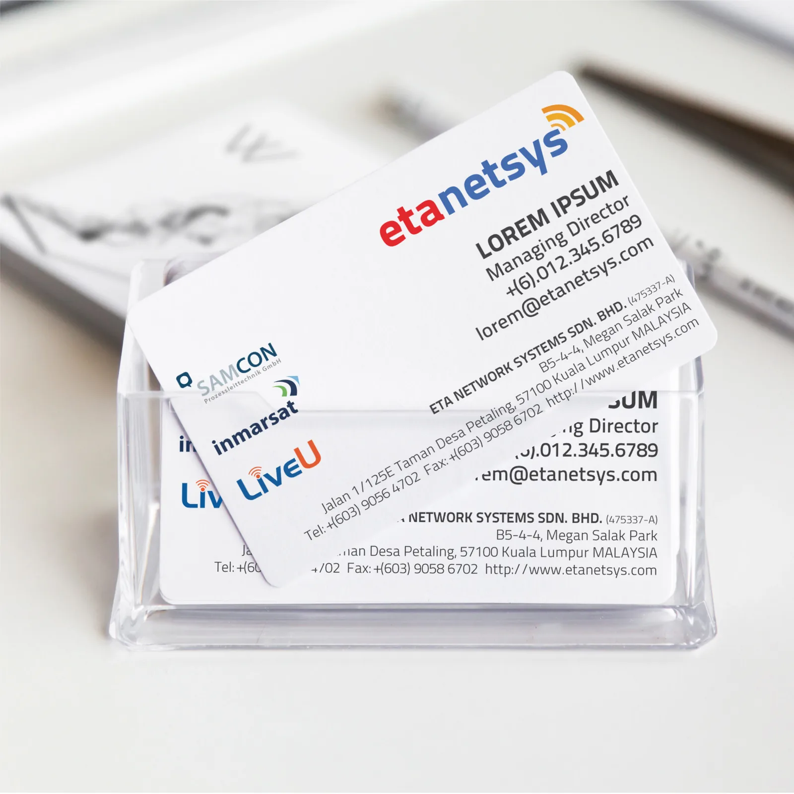
ETA Network Systems Sdn. Bhd. is a systems integration and security technology company. Pixelworx developed its logo, company profile, stationery, business cards and website.
The work strengthened the company’s corporate image and helped set it apart from others in its industry.
Design intent
The identity is designed to signal competence before a word is read: technical, contemporary and consistent across every document the company puts its name to.
The idea
The full company name is compressed into a single word that is quick to read and easy to remember.
- Wordmark
- ‘etanetsys’ contracts ETA Network Systems into one lowercase word set in a rounded geometric sans — modern and approachable.
- Symbol
- Signal arcs rise from the end of the word, a direct cue for network and wireless infrastructure.
- Colour
- In colour, ‘eta’ is set in red and ‘netsys’ in blue, with the signal arcs graded from orange to yellow. A single-colour version carries the same form.
Visual system

Application
Outcome
Credibility is built from consistency. The identity gave ETA one dependable face across its profile, stationery and website.