Making the name memorable.
A restaurant identity designed to move from recognition into experience — from the name above the door to the menu in the customer’s hands.
02
Context
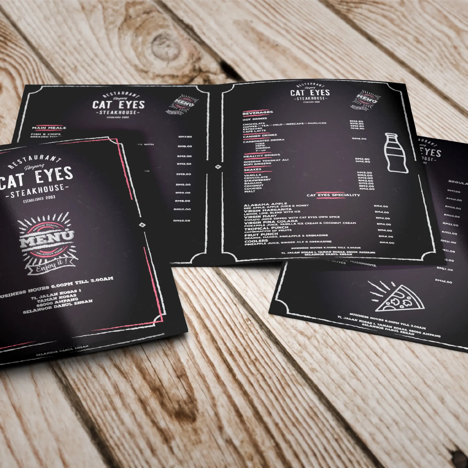
Cat Eyes is a steakhouse restaurant in Taman Kosas, Ampang. The restaurant needed a memorable brand, carried through to its menu, order sheet and printed material.
The identity exists in two versions, both shown below.
03
Design intent
The identity is designed to make the name easy to recall and to set expectations before the first course: robust, familiar and unpretentious.
04
The idea
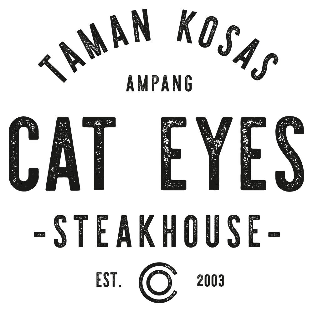
A classic steakhouse badge with a worn, printed texture — a mark that looks as though it has always been above the door.
- Typography
- CAT EYES in condensed, distressed capitals; ‘Steakhouse’ in spaced capitals between short rules; ‘Ampang’ as a script accent.
- Texture
- A roughened, printed finish on the letterforms recalls stamped signage and grill-house tradition.
- Composition
- An arched ‘Restaurant’ crowns a stacked, centred lock-up that sits naturally on a menu cover or a signboard.
05
Visual system

06
Application
07
Outcome
The identity gives Cat Eyes a name customers can hold on to — carried from the sign to the printed menu in their hands.