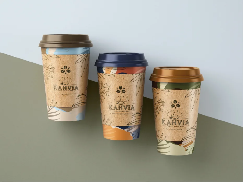
From coffee mark to brand system.
Kahvia was more than a logo refresh. The identity became the starting point for a broader visual system spanning packaging, digital communication and the brand’s online presence.
Context
Kahvia is a coffee and tea brand. Pixelworx refreshed its identity and developed designs for its packaging, website, social media, catalogue, digital flyers and business cards.
Design intent
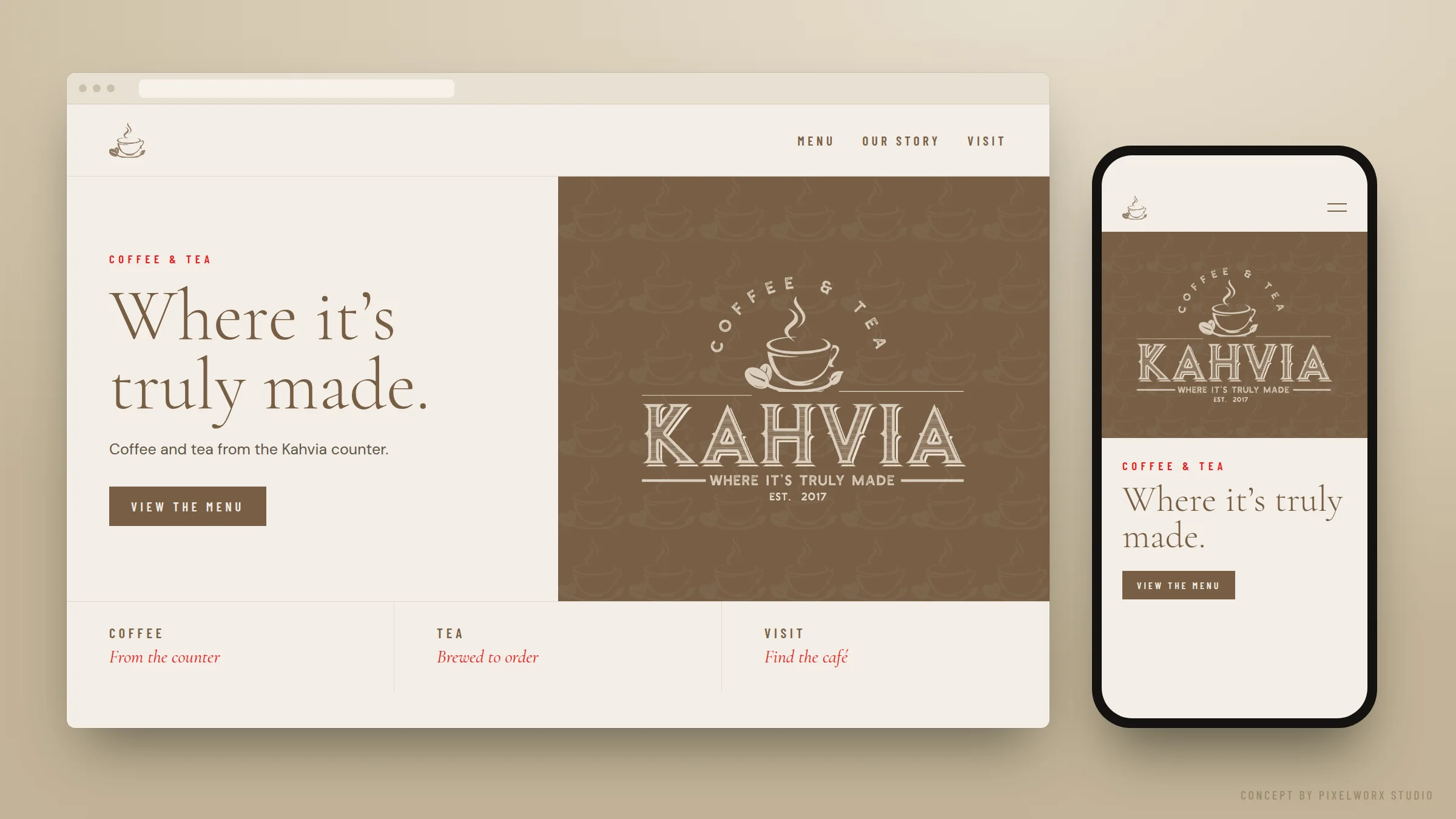
The identity is designed to hold together as a system rather than sit alone as a sign: one mark that keeps its character on a cup, a catalogue page and a phone screen.
The idea
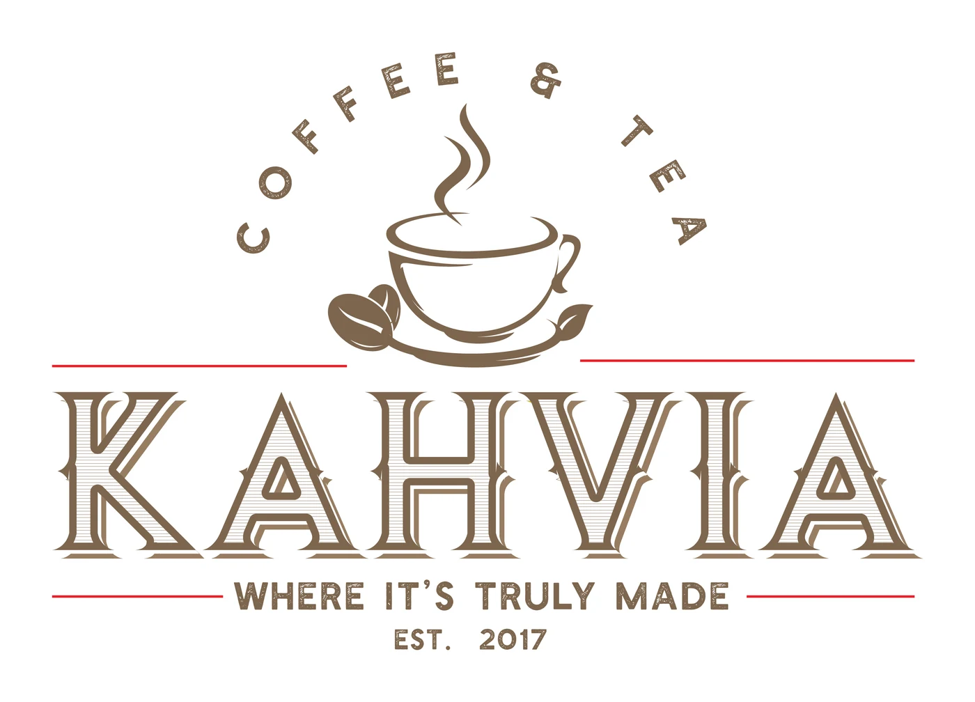
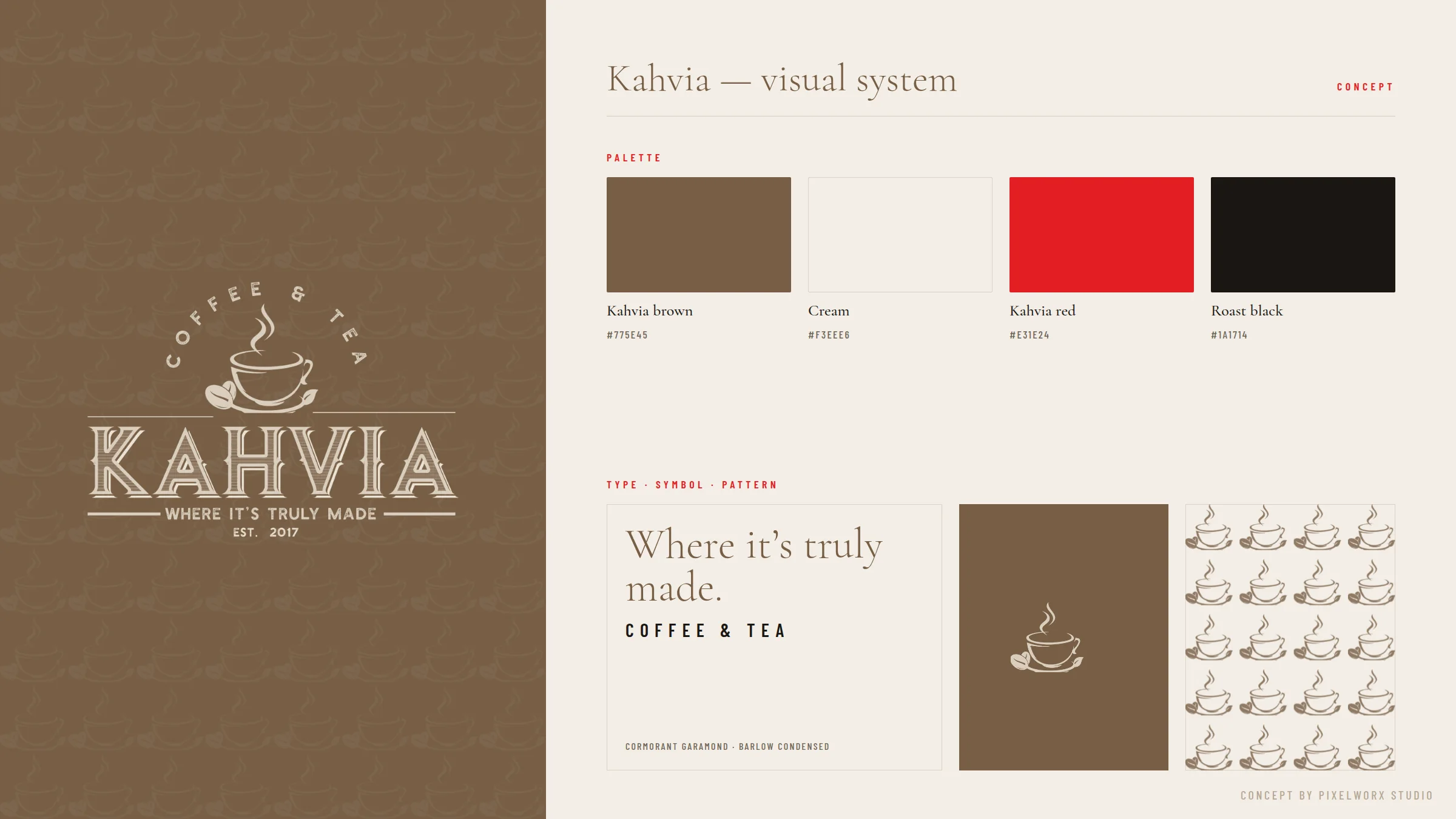
The mark draws on the language of the traditional coffee house — engraved letters, a steaming cup, a ruled frame — and sets it into one disciplined lock-up.
- Symbol
- A cup with rising steam and two coffee beans sits above the name. It is the most direct category cue available, used plainly.
- Typography
- KAHVIA is set in engraved, inline capitals with strong serifs, giving the name weight and a sense of craft. Supporting lines are set in small, spaced capitals.
- Composition
- Rules frame the wordmark, with ‘Coffee & Tea’ arched above and ‘Where it’s truly made’ beneath. The lock-up reads from product to promise.
- Colour
- In colour, the mark is set in a warm coffee brown, with fine red rules framing the wordmark.
Visual system

Application
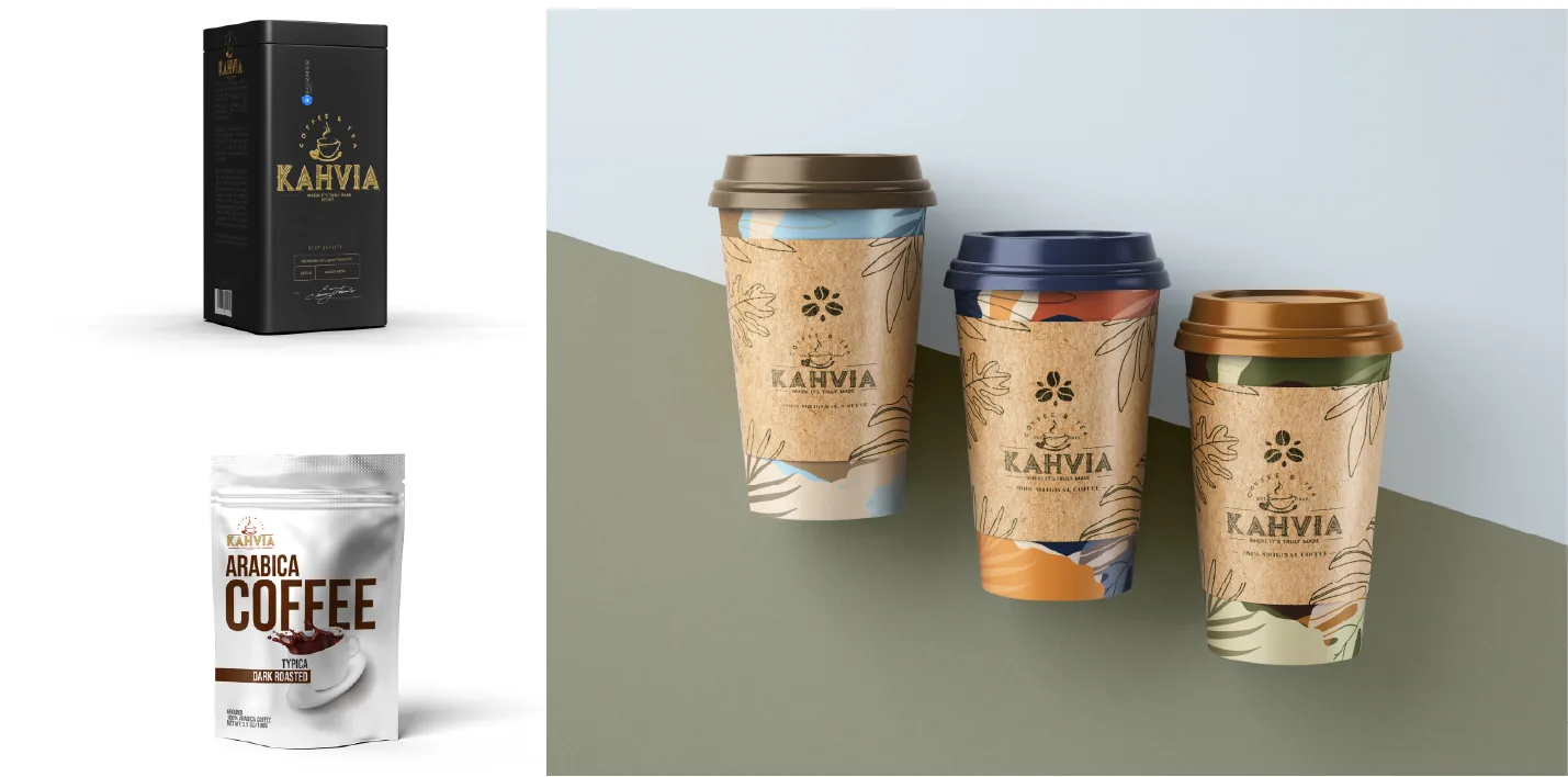
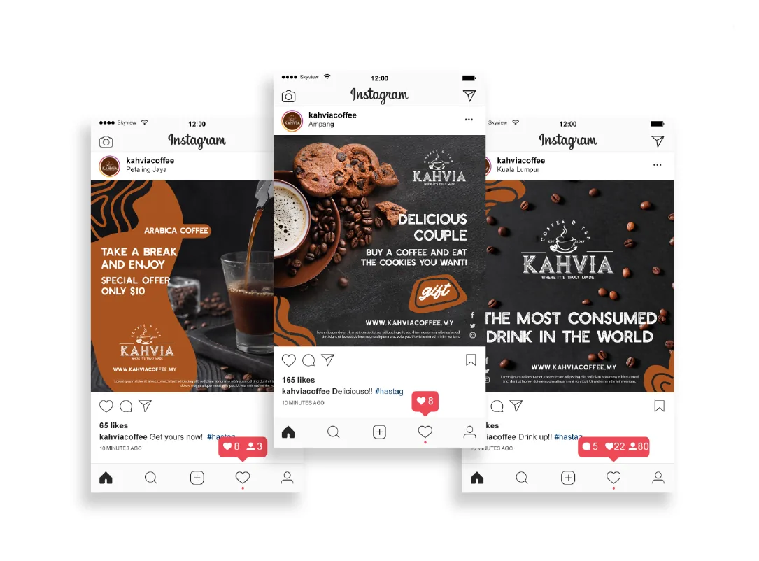

Identity in use — concept
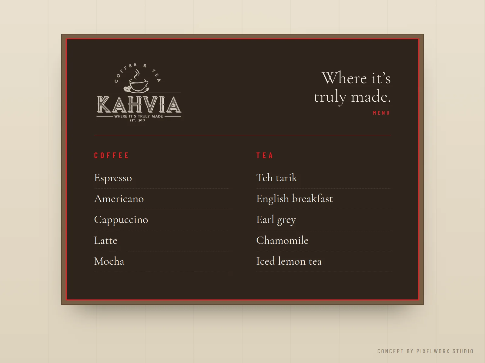
Concept extensions developed by Pixelworx to show how the identity scales. They are not client-commissioned work.
Outcome
The refresh gave Kahvia more than a new mark: one identity, and a set of designs to carry it across packaging, print and screen — the foundation of a visual system rather than a one-off logo.